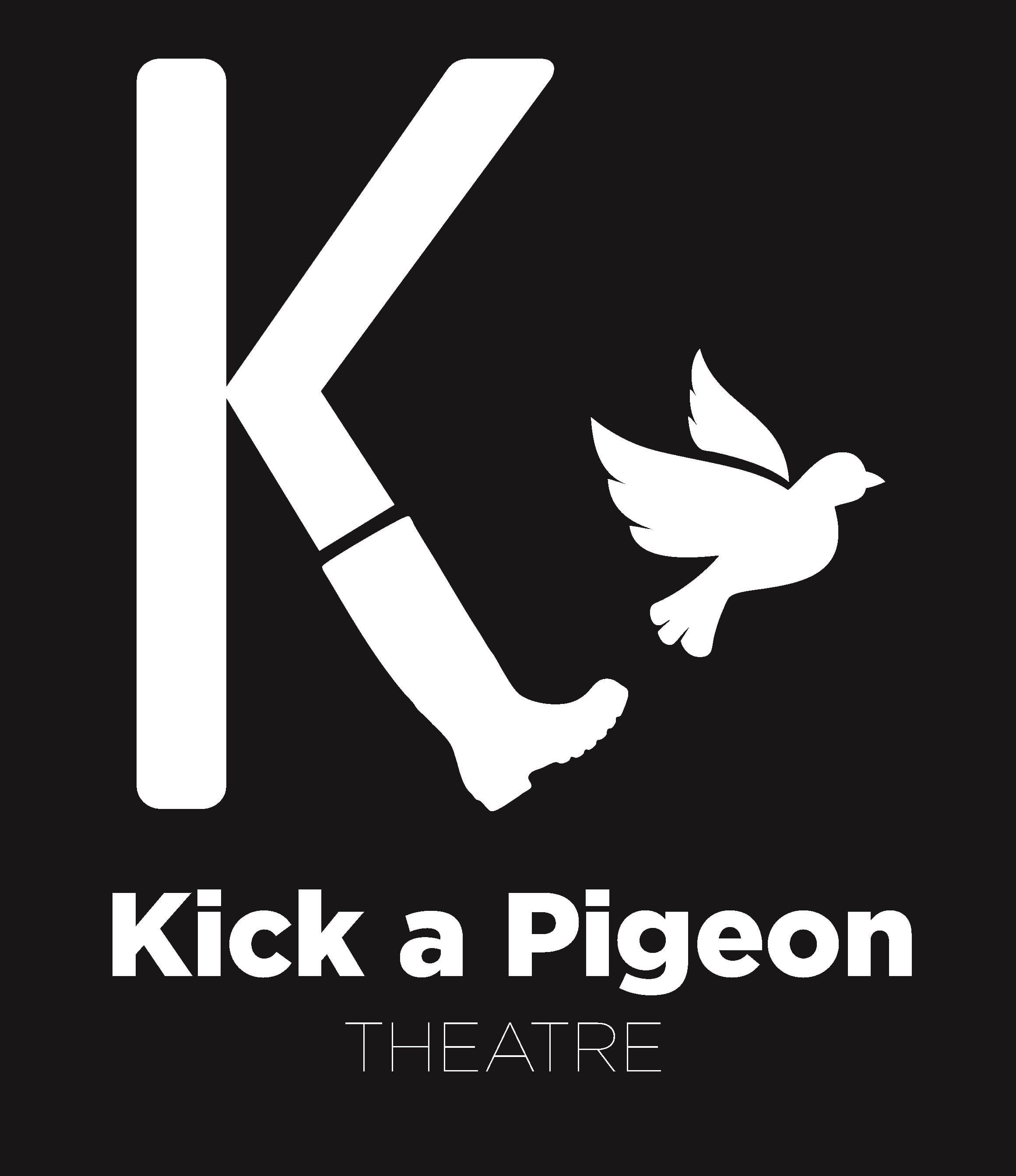
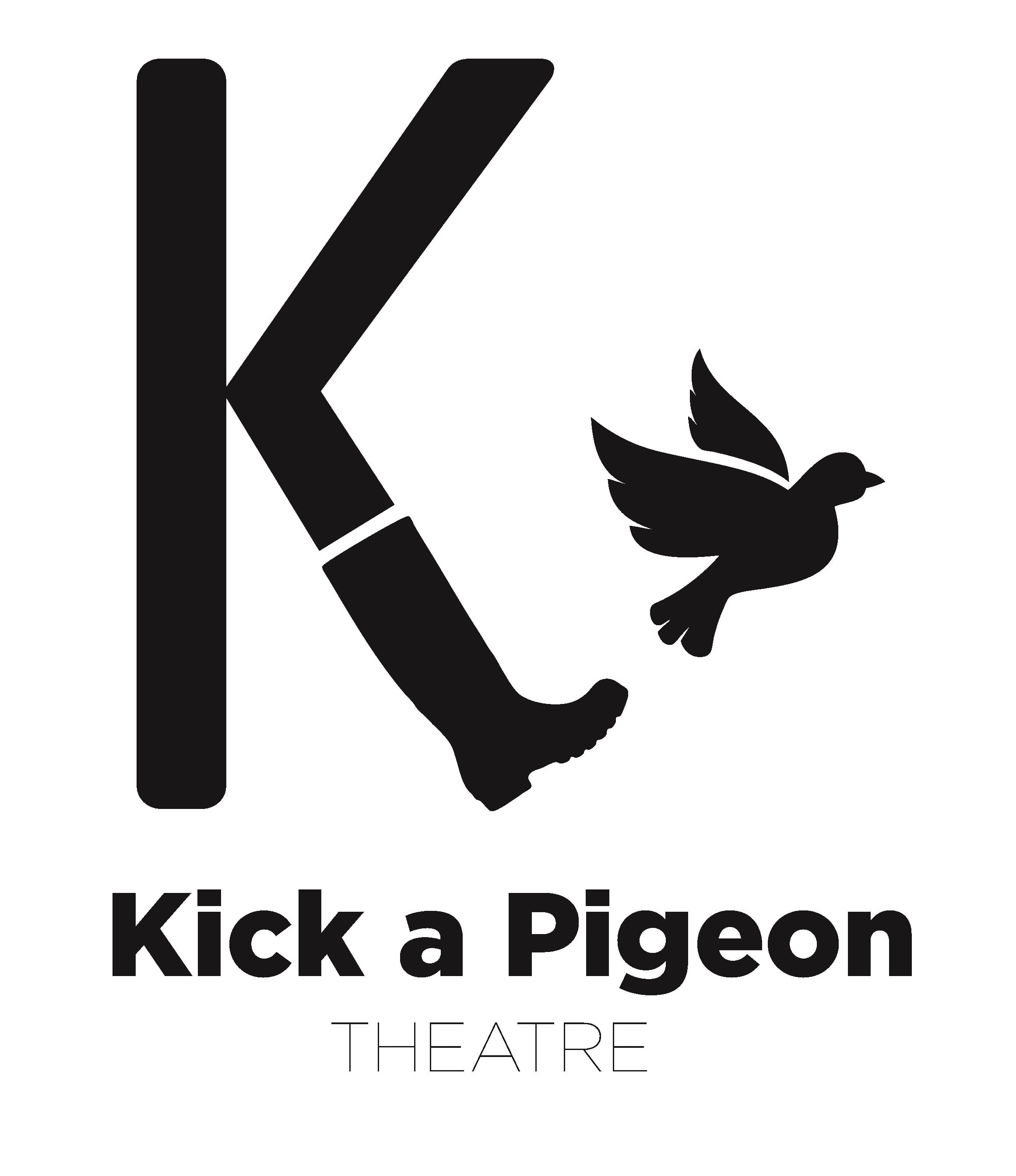
With our chosen company name being ‘Kick a Pigeon Theatre’ it opened up opportunities to create a quirky and tongue in cheek logo. With the name being unique it was a prime opportunity to create something special to advertise our company.
“In marketing, the brand name is a major selling tool and one important component of the product offer” (Ramaswamy, 2013, 342).
Numerous sketches were made for the logo of our company. I pitched the potential ideas to the group and the ideas were narrowed down to a select few. The initial process of designing the logos was a method of trial and error.
The final logo idea was then created on Photoshop, it took a substantial amount of time to create the logo due to testing out different effects and colouring which would best reflect the company.
(Kick A Pigeon Theatre, 2017b)
 (Kick A Pigeon Theatre, 2017c)
We decided to select the logo to have a black background and white image and text, this is due to it being bolder and distinct. The comical play on the ‘Kicking K’ paralleled our intended humour as a company.
Works Cited
Ramaswamy. (2013) Marketing Management. India: Mc Graw Hill.
Kick A Pigeon Theatre. (2017a) Logos. [image] Lincoln Performing Arts Centre: Kick A Pigeon Theatre.
Kick A Pigeon Theatre. (2017b) Logo – Black. [image] Lincoln Performing Arts Centre: Kick A Pigeon Theatre.
Kick A Pigeon Theatre. (2017c) Logo – White. [image] Lincoln Performing Arts Centre: Kick A Pigeon Theatre.