In our next session we knew that we had to start getting more specific details about what we wanted to create and the type of company we wanted to be. We decided we wanted to be a company that didn’t shy away from issues and created truthful drama. So even though our name, Kick a Pigeon Theatre, came from a personal story we did develop a meaning to it. That as pigeons are classed as vermin, the issues of today are the pigeon and we must ‘kick’ them.
From the out start we wanted to set our piece in either the 1980’s or the 1990’s because we loved the music and culture from those two decades. As we started to do research into the two decades, we started to lean more towards the 1990’s as some of the issues that were happening then are still relevant now. As we were all born in the 1990’s as well, we felt a more personal connection to it and still had memories from that decade, so, we felt, we could make a more truthful representation of the time.
As soon as we had decided on the 1990’s, I started to research flats and record stores from that decade to see how it was furnished then. Originally I wanted the set to be composed of an apartment kitchen and a record store, with the audience making their own decision as to whether the kitchen was connected to the store or the apartment above. This was to enhance a feeling that the characters lives were the record store and everything they needed to survive was in it. The images below are ones I found through my research and wanted to convey the ‘homely’ feel of the apartment on the right through my set.

Traditional 90’s Style Apartment (uglyhousephotos, 2009)
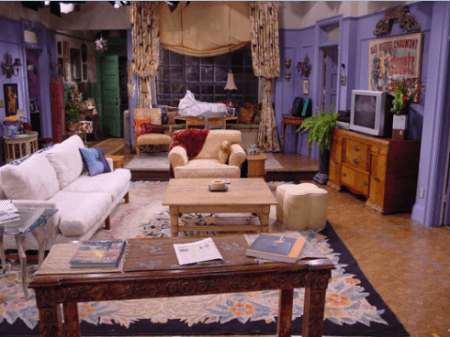
Apartment from “Friends” (Pinterest, 2012)
Traditional 90’s record store (andyhifi)

Traditional 90’s Record Store with Merchandise (MostlyRetro, 2016)
I found the images above when I started researching the 90’s record stores, and I discovered that they were commonly overstocked, containing records dating back from when the stores originally opened. This meant that for set, I could have a suggestion of the 80’s culture littered around, giving a similar atmosphere as I felt the images above show. From these images I knew that I wanted to keep the cluttered appearance, with obstacles you’d often find within these stores such as vinyl containers and other similar merchandise pertaining to the cultures previously mentioned. I thought it seemed “on paper, deceptively simple” (Johnson, 2002, 12) to fill the space, almost like an obstacle course, however because we had a specific time period to adhere too, the ‘obstacles’ had to be in keeping with that and ‘of the time’. It also had to be safe for the actors to move about the stage, to help them get used to the obstacles that would be there, chairs were used in rehearsals to represent the different things that would be littered around the stage. Even though, I was aiming for a cluttered feel, I didn’t want it to look messy, the aim was for structured clutter.
Works Citied
andyhifi Record Stores in Los Angeles & the Internet [blog]. Available from: http://andyhifi.50webs.com/records.htm accessed 9 February 2017.
Johnson, D. (2002) Farce of Nature Designing Three Very Different (And Very Sturdy) Sets for Noises Off. Entertainment Design, 36 (3)
MostlyRetro (2016) The Biggest Guide to Tokyo Record Stores on the Internet [blog]. 3 October. Available from: http://mostly-retro.com/2016/10/03/the-biggest-guide-to-tokyo-record-stores-on-the-internet/ accessed 9 February 2017.
Pinterest (2012) Friends Shabby Chic: Stuck in Second Gear [blog]. 19 November. Available from: https://uk.pinterest.com/pin/146155950380276054/ accessed 9 February 2017.
uglyhousephotos (2009) The Splendor of Southwest Styling [blog]. 7 November. Available from: http://uglyhousephotos.com/wordpress/?cat=113 accessed 9 February 2017.